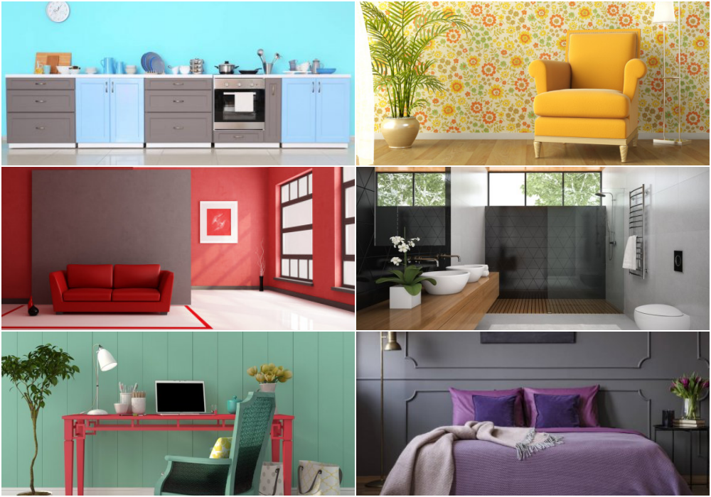
Color psychology in home decor influences mood and atmosphere. Different colors can evoke various emotions and set the tone of a room.
Color psychology plays a significant role in home design, helping to create desired moods and atmospheres. Selecting the right colors can transform a space, making it feel more inviting, relaxing, or energizing. Warm colors like red and yellow can stimulate and inspire, while cool tones such as blue and green promote calm and tranquility.
Neutral shades like beige and gray offer versatility and sophistication. Understanding the psychological impact of colors allows homeowners to curate environments that reflect their personality and meet their emotional needs. Thoughtful color choices can enhance overall well-being and improve the living experience.
Introduction To Color Psychology In Home
Understanding color psychology can transform your home. Colors influence our emotions and actions. They play a crucial role in our daily lives.
Each color has a unique impact on our mood and behavior. Choosing the right color for each room can enhance your living experience.
Impact On Mood
Colors can make us feel different emotions. For instance, blue is calming and soothing. It is perfect for bedrooms or bathrooms.
Red is energetic and exciting. It can boost your adrenaline. Use it in your living room or dining area.
Yellow brings happiness and warmth. It is great for kitchens and playrooms.
Influence On Behavior
Colors also affect our actions. Green promotes balance and relaxation. It is ideal for home offices or reading rooms.
Orange is inviting and friendly. It encourages conversation. Use it in social areas like the living room.
Purple inspires creativity and luxury. It works well in creative spaces and bedrooms.
Credit: www.lewith-freeman.com
Choosing The Right Color Psychology In Home
Leave a Comment / Tips & Advice / By ashrafsalman
Choosing the right colors for your home can transform its entire atmosphere. The right shades can make a room feel inviting, calming, or invigorating. Let’s dive into how to pick the best colors for your home.
Color Wheel Basics
The color wheel is a great tool to start with. It shows primary, secondary, and tertiary colors. Here’s a simple breakdown:
- Primary Colors: Red, blue, and yellow. These colors can’t be made by mixing other colors.
- Secondary Colors: Green, orange, and purple. These are made by mixing two primary colors.
- Tertiary Colors: These are made by mixing a primary color with a secondary color.
Using the color wheel helps you understand how colors relate to each other. This knowledge is essential for creating a harmonious color scheme.
Harmonizing Hues
Creating harmony in your home involves blending colors that work well together. Here are three ways to harmonize hues:
- Analogous Colors: These are next to each other on the color wheel. They create a serene and comfortable design. For example, blue, blue-green, and green.
- Complementary Colors: These are opposite each other on the color wheel. They create a vibrant look. For instance, blue and orange.
- Triadic Colors: These are evenly spaced around the color wheel. They offer a balanced and vivid look. Think of red, yellow, and blue.
Consider what mood you want to evoke in each room. For a calming effect, use analogous colors. For a lively space, choose complementary colors. For a balanced look, opt for triadic colors.
Here’s a quick reference table for different color harmonies:
| Color Harmony | Characteristics |
|---|---|
| Analogous | Serene, comfortable, cohesive |
| Complementary | Vibrant, high contrast, lively |
| Triadic | Balanced, vivid, dynamic |
Remember, the right color choices can enhance your home’s aesthetic and emotional appeal.
Living Room Color Ideas
Choosing the right colors for your living room can transform the space. Colors have a powerful impact on mood and ambiance. This section explores various color ideas for your living room.
Warm Tones
Warm tones create a cozy and inviting atmosphere. These colors can make your living room feel welcoming.
- Red: Red is energetic and stimulating. It can boost conversation.
- Orange: Orange is cheerful and warm. It evokes a sense of comfort.
- Yellow: Yellow brings happiness and light. It can make a room feel bright.
Combining these warm tones with neutral accents can balance the room. For example:
| Warm Color | Neutral Accent |
|---|---|
| Red | Beige |
| Orange | White |
| Yellow | Gray |
Cool Tones
Cool tones can create a calm and relaxing environment. These colors are perfect for unwinding.
- Blue: Blue is soothing and tranquil. It can reduce stress.
- Green: Green is refreshing and natural. It brings a sense of peace.
- Purple: Purple adds a touch of luxury. It can make the room feel elegant.
Using cool tones with complementary colors can enhance their effect. Consider these combinations:
| Cool Color | Complementary Accent |
|---|---|
| Blue | Brown |
| Green | Wood Tones |
| Purple | Gold |
Color Psychology in Home For Bedroom
Choosing the right colors for your bedroom is crucial. Colors can impact your mood and sleep quality. Here are some suggestions to help you create the perfect sanctuary.
Relaxing Shades
Relaxing shades can help you unwind and sleep better. Consider these options:
- Blue: Blue is known for its calming effects. It can reduce stress and anxiety.
- Green: Green represents nature and tranquility. It can create a serene environment.
- Lavender: Lavender is soft and soothing. It can promote relaxation and calmness.
These colors can transform your bedroom into a peaceful retreat.
Energizing Hues
Some colors can energize you and make your bedroom lively. Here are a few suggestions:
- Yellow: Yellow is cheerful and bright. It can add warmth and energy to your room.
- Orange: Orange is vibrant and fun. It can boost your mood and creativity.
- Red: Red is bold and passionate. It can add a touch of excitement to your bedroom.
These hues can make your bedroom a more dynamic space.
| Color | Effect |
|---|---|
| Blue | Calm and reduce stress |
| Green | Tranquil and serene |
| Lavender | Soothe and relax |
| Yellow | Cheerful and warm |
| Orange | Vibrant and fun |
| Red | Bold and passionate |
Kitchen Color Inspirations
The kitchen is the heart of the home. Choosing the right colors can transform the space. Different colors can evoke different feelings. Let’s explore some kitchen color inspirations.
Bright And Cheerful
Bright colors make the kitchen lively. Yellow is a popular choice. It brings warmth and happiness. Orange is another option. It adds energy and excitement. Bright colors can make a small kitchen feel larger.
| Color | Effect |
|---|---|
| Yellow | Warmth and Happiness |
| Orange | Energy and Excitement |
Use these colors for walls or cabinets. They can also be used in accessories. Think of bright curtains or colorful dishes.
Elegant And Modern
For a sleek look, choose elegant colors. Gray is a top choice. It adds a modern touch. Black is bold and sophisticated. White makes the kitchen look clean and spacious.
- Gray: Modern and Sleek
- Black: Bold and Sophisticated
- White: Clean and Spacious
Pair these colors with stainless steel appliances. Add metallic accents for extra shine. Use marble countertops to complete the look. Elegant colors can make any kitchen look high-end.

Credit: www.realtor.com
Bathroom Color Choices
Choosing the right colors for your bathroom can transform the space. The right shades can create a calm, inviting atmosphere or a vibrant, energetic space. Here are some ideas to help you choose the perfect bathroom colors.
Spa-like Ambiance
For a spa-like ambiance, opt for soft, muted tones. Shades of light blue and green are perfect. These colors evoke a sense of tranquility and relaxation. Consider using white accents to enhance the serene feel. Adding natural elements like wooden shelves can also help.
| Color | Effect |
|---|---|
| Light Blue | Calming |
| Green | Refreshing |
| White | Clean |
Consider adding plants or a small fountain for an extra touch. These elements can enhance the spa-like feel of your bathroom.
Vibrant And Fresh
If you prefer a more vibrant and fresh bathroom, bold colors are your best bet. Bright yellows, oranges, and reds can energize the space. These colors are great for morning routines, as they can help wake you up.
- Yellow – Cheerful and uplifting
- Orange – Warm and inviting
- Red – Energetic and bold
Use these colors on one wall or in accents to avoid overwhelming the space. A bright shower curtain or colorful towels can add a pop of color without being too much.
Mixing these bold colors with neutral tones can balance the look. A neutral backdrop with vibrant accents can create a fresh, modern bathroom.
Home Office Colors
Your home office color scheme can impact your mood and productivity. Thoughtful color choices can help you work better and feel more relaxed. Let’s explore the best colors for your home office.
Productivity Boosters
Choosing the right colors can make you more productive. Here are some top choices:
- Blue: Blue is calming and helps you stay focused.
- Green: Green reduces eye strain and keeps you feeling fresh.
- Yellow: Yellow boosts energy and lifts your mood.
- White: White makes your space look clean and organized.
Blue and green are perfect for long work hours. Yellow is great for short, intense tasks. Use white for a minimalist and clutter-free look.
Creative Spaces
For creative work, choose colors that spark imagination. Here are some options:
- Red: Red increases energy and passion. Great for brainstorming.
- Purple: Purple inspires creativity and innovation.
- Orange: Orange is warm and welcoming. It encourages social interaction.
- Turquoise: Turquoise is refreshing and stimulates thinking.
Mix these colors to create a vibrant, creative space. Use red in small doses to avoid feeling overwhelmed. Purple and turquoise are ideal for artistic work.
| Color | Effect |
|---|---|
| Blue | Calming, Focused |
| Green | Fresh, Reduces Eye Strain |
| Yellow | Energetic, Uplifting |
| White | Clean, Organized |
| Red | Energetic, Passionate |
| Purple | Creative, Innovative |
| Orange | Welcoming, Social |
| Turquoise | Refreshing, Stimulating |
Choose the right colors to create a productive and creative home office. Your color choices can make a big difference.

Credit: www.alustforlife.com
Accent Colors And Accessories
Accent colors and accessories can transform a room. They add personality and charm. These elements are easy to update. They provide a quick refresh to any space.
Using Accent Walls
Accent walls are a popular choice. They create a focal point in any room. A bold color can add energy. A soft hue can bring tranquility.
Steps to create an accent wall:
- Choose the wall you want to highlight.
- Select a color that complements your space.
- Paint the wall with care for a smooth finish.
Incorporating Decor
Decor items are perfect for adding accent colors. Pillows, rugs, and curtains are great choices. They are easy to swap out for a new look.
Popular decor items:
- Pillows: Available in various colors and patterns.
- Rugs: Add warmth and texture to the floor.
- Curtains: Can make a bold statement or blend in.
Decor items can also include vases, picture frames, and art. These pieces can reflect your personal style. They add unique touches to your space.
Tips For A Cohesive Look
Creating a cohesive look in your home is essential. It helps in establishing a balanced and harmonious atmosphere. Below are some tips to achieve this look through color psychology.
Color Flow
Color flow ensures a smooth transition between rooms. Choose a base color that appears in each room. This creates a sense of unity and continuity.
| Base Color | Complementary Colors |
|---|---|
| Blue | White, Grey, Yellow |
| Green | Beige, Brown, Gold |
Tip: Use accent pieces like pillows or artwork to incorporate the base color.
Balancing Bold And Neutral
Bold colors can make a statement. Neutral colors offer a calming effect. Balance them for a cohesive look.
- Start with a neutral base: white, beige, or grey.
- Introduce bold colors sparingly: red, blue, or green.
- Ensure bold colors don’t overwhelm the space.
Example: Paint one wall in a bold color and keep others neutral.
- Living Room: Neutral sofa with bold pillows.
- Bedroom: Neutral bedspread with bold throw blanket.
Frequently Asked Questions
What Is Color Psychology In Home Design?
Color psychology studies how colors affect emotions and behaviors in home environments. Different colors can create various moods and atmospheres.
How Do Colors Affect Mood At Home?
Colors can influence feelings. For example, blue is calming, while red energizes. Choosing the right color can enhance comfort.
Which Colors Are Best For Relaxation?
Neutral colors like beige and light blue promote relaxation. They create a serene and peaceful atmosphere in your home.
What Color Is Good For A Home Office?
Yellow is great for a home office. It stimulates creativity and enhances concentration, making it ideal for workspaces.
Conclusion
Embracing color psychology can transform your home into a haven of harmony and peace. Choose colors that reflect your personality and create desired moods. By understanding the impact of colors, you can enhance your living space effectively. Start experimenting with colors today and experience the positive changes they bring to your home.